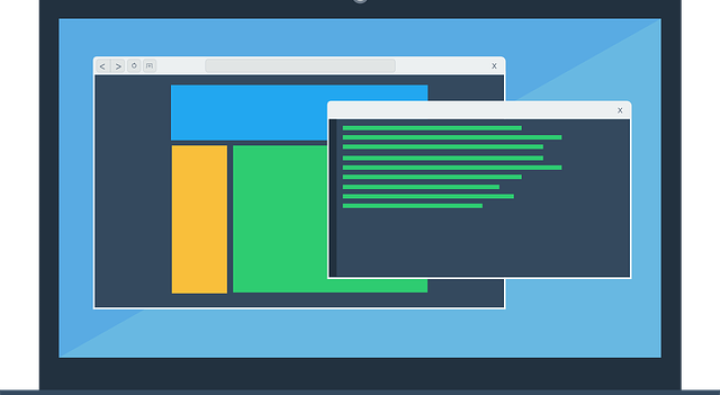
Virtual reality, 3D TVs, ultra-high-definition—while much of the world tussles to make digital appear more real than real life, web and app design is going flat. With flat design, marketers and designers are jettisoning their past obsession for 3D in favor of function-first, 2D creations.
A more sophisticated evolution of minimalist design, flat design champions clean features, clear spaces, crisp lines, bright colors, and usability. This design approach can handle a lot of complexity by stripping away 3D effects. It works with the limits of the screen rather than against them, streamlining designs for faster and more functional websites and apps.
Scrapping Skeuomorphism
Flat design emerged in response to skeuomorphism. The practice of mimicking the look of an object in design, skeuomorphism aims to evoke a sense of familiarity in digital tools and new concepts. In digital terms, think of how the calculator, analog clock, and calendar on your computer resemble their real-world counterparts.
Skeuomorphism has many limitations. The requirement to stick to real-world constraints is irrelevant in digital. It limits functionality and creativity. Beyond this, skeuomorphic elements can decrease loading time, take up valuable screen space, and they often look out of place alongside less three-dimensional elements.
Freedom in Flat Design
Flat design frees designers from the limitations of trying to mimic a physical experience. Instead of attempting to replicate the 3D nature of real-world items, we can tailor design to the screen.
To enhance the digital experience, Flat design combines the benefits of minimalism and skeuomorphism. It reflects the inviting nature of skeuomorphism by offering an intuitive interface, while taking a minimalist approach to promoting functionality.
Let’s have a look at the three main benefits of flat design.
It’s simple to use.
It is clean, simple, and intuitive. It emphasizes the need for minimalism. The result is de-cluttered webpages and streamlined apps. Technology built with Flat Design is more visually appealing and easy to navigate.
It focuses on functionality.
This clean interface directs the user’s attention to functions that allow them to use the technology. This lets users quickly extract value from your website or app, while allowing you to communicate key messages without competing distractions.
It’s designed for great UX.
Intuitive design and a focus on functionality leads to a better user experience. At the same time, removing heavily styled elements speed up load times. This allows you to create responsive designs that move seamlessly between devices for a more cohesive user experience.
The design world is awash with attractive trends that lose their charm fast, but flat design offers more than aesthetic appeal. With a focus on functionality and simple good looks, this design trend delivers an elevated user experience. It is here to stay.
Want to learn more about the latest design trends, and how they can improve your site’s UX? Contact us today.


