Website design tips from Kirsten Grossmann
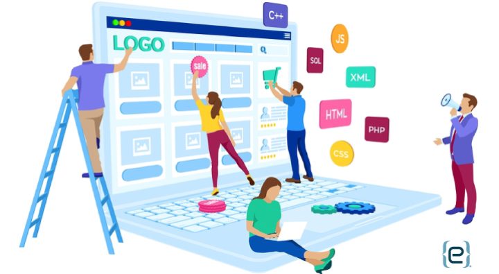
R.H. Macy changed storefronts forever in 1874 when he gave New York City the country’s first magical Christmas windows. Macy understood the power of visuals to draw attention, attract customers and drive sales. Likewise, for modern businesses, an effective website design uses visual appeal to help visitors find the information they need and perform the actions you want.
Think about the elements that draw you to a website and, even more importantly, inspire you to look around and engage. The arrangement of items on the page, effective use of images and wise color choices are three essential elements that can make the difference between a website that is simply beautiful and a website that works.
White Space is Your Friend
As human beings, we crave space. We need space to think, space to stretch. Similarly, the most effective website designs employ low visual complexity. Too many images and words crowding the page make it difficult for visitors to focus. They tire quickly in their search for answers, and clutter distracts them from the calls to action you hope they will take.
On the other hand, white space between improves readability. Visitors can quickly locate desired information without the distraction of too many design elements. And they are less likely to bounce out of the site before engaging.
Remember that white space does not actually have to be white. It just needs to be space free of images and words. Large areas of white space around key elements of a page point the visitors’ attention to those elements. In addition, the micro white space in between letters and lines of text also contributes to readability.

Powerful Images
Images attract the eye and make your website more personal. They can convey information in a memorable way. Used incorrectly, they simply distract. Keep in mind a few basic hints for effective image use:
- Use high quality images – Avoid images that are low resolution, poorly cropped or poorly arranged.
- Images must be relevant, not just decorative – Make sure that the images you use further your purpose and goals.
- Use people pictures – Photos of people humanize your organization. But avoid stock photos. Instead, try to include pictures of real people who are part of your organization. You can also use the positioning of the faces to direct attention toward elements on the page.
- Tap into the power of infographics – A well-designed infographic can sometimes convey essential information much more effectively than a large, complex block of text.
Color with a Purpose
Color can improve usability, add structure and communicate both mood and brand. At the most basic, choose text and background colors that complement each other and that contrast enough to aid readability. Standout colors can highlight action buttons, and consistent use of color can guide the user along the path to information.
A little color psychology can prove helpful. For example, blue represents trust and stability. Think of companies like American Express or Oral-B. Green is easy for the eyes to process and can be associated with both money and nature. Red is intense and suggests a sense of urgency. Keep in mind the message you want to convey as you choose colors for your website.

Invest in Thoughtful Website Design
Your website is the gateway to your organization and an essential piece of your marketing strategy. It is essential to invest the time and resources to achieve a website design that promotes user engagement and conversion. Visual elements such as white space, effective images and deliberate use of color can take your website and your business to the next level.
eMazzanti has an award-winning digital marketing and website design team ready to help you develop an exceptional website that works. Tap into our expertise and experience the possibilities.
Kirsten Grossmann is completing a web design internship at eMazzanti before returning to Scotland to finish her degree at the University of Dundee.
Website design tips from Kirsten Grossmann


